Natalie, Andy and I submitted a rough draft (March 13th version) to Theresa Nelson for her comments and mid-project critique. Today, we addressed all of her concerns and created our final draft.


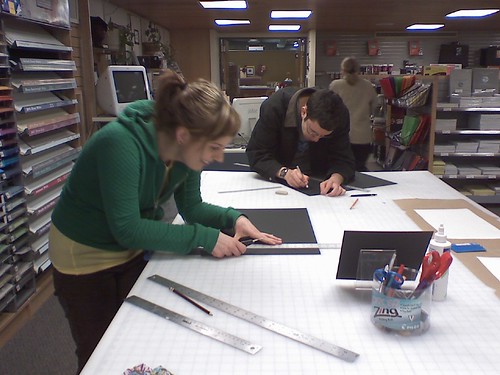
Here is a photo of Natalie and Andy happily preparing our mat boards for mounting the final design:

On Thursday, the three projects that the class created will be formally presented to Theresa for further critique and possible use by the Midtown Greenway Coalition.


I appreciated sticking to your original plan of omitting the photographs. It was a good decision.
The only thing I was bothered by was the text that laid behind the “Become part of the Movement!” headline. It seemed to distract from the simplicity of the piece.
I was super excited about the brochure you guys came up with. I think incorporating the hand painted background gave the whole piece a more home-made, less corporate feel that Theresa was really interested in. I also really enjoyed the four fold layout simply because it’s less common and, I believe, requires more “user involvement” if you will.
My one critique is the cover layout that you stuck with. Since basically every other part was so thought out and precise, it seemed like you ran out of time or something. Overall, very impressive!
Looks good. Can’t wait to see this in my mailbox.